On this page
Case Study
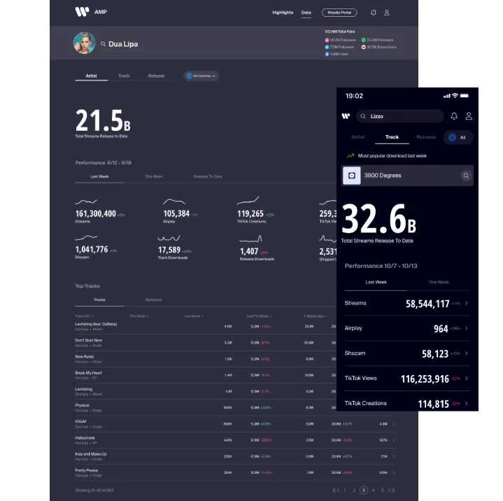
Warner Music Group / AMP
Turning analytics into shareable highlight reels
What this proves
I can turn dense analytics into shareable, role-aware product surfaces by deciding what belongs, what gets simplified, and how evidence gets packaged for real use.
Getting oriented
AMP is Warner Music Group's analytics product for artists and managers. Before this work, users were already sharing performance data publicly, but they were doing it the hard way: screenshotting views, cropping them by hand, and posting them outside the product. That made a high-value behavior feel improvised and unverified.
The opportunity was not just to add a share button. It was to define what information belonged in a shareable package, how much of it should travel together, and how to make the result feel native to the places artists already used to engage fans.
This was not just a share-button problem. The team had to decide which analytics were trustworthy enough to share publicly, how those insights should be grouped, and how the package should change across artists, managers, and label-side needs. That made the work as much about information architecture and relevance as visual polish.
Why the format had to be story-first
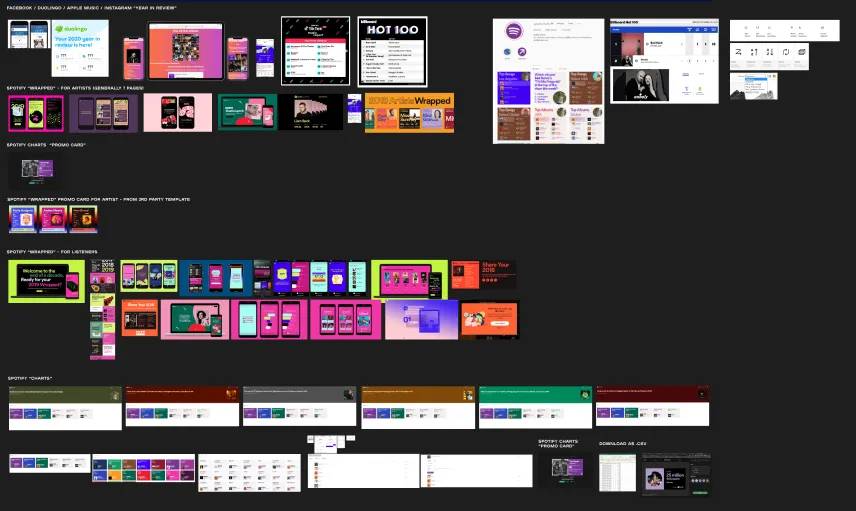
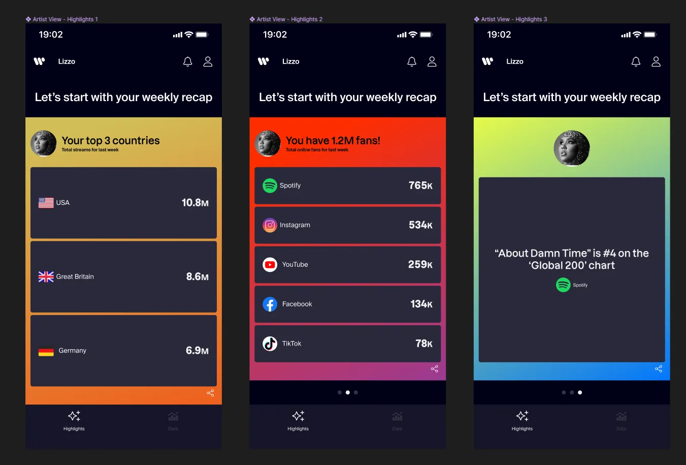
Stakeholder interviews, benchmarking, and user validation all pointed in the same direction. Instagram Stories emerged as the primary destination, which shifted the problem away from generic export and toward story-first packaging. Competitive review across year-in-review and social-share patterns reinforced a few important constraints: fast publishing, minimal save friction, and multi-card bundles rather than one isolated stat.
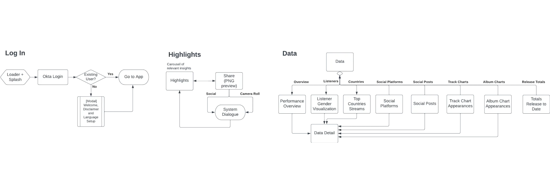
Mapping where Highlights belonged
The feature also needed a coherent place inside AMP. I facilitated a site-map and user-flow workshop with Product Owners and design leadership to map how Highlights should relate to the rest of the product. That work shaped both the information architecture and the eventual placement of the Highlights page after launch.
Defining the Highlights package (Shipped)
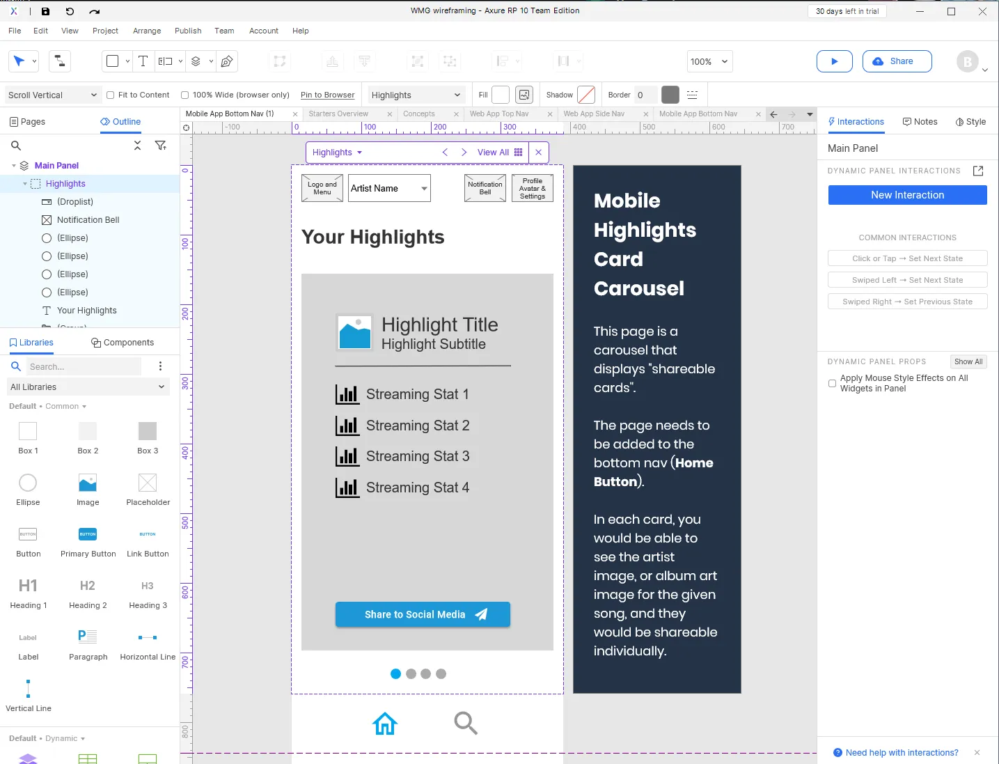
Using block wireframes to make the structure legible
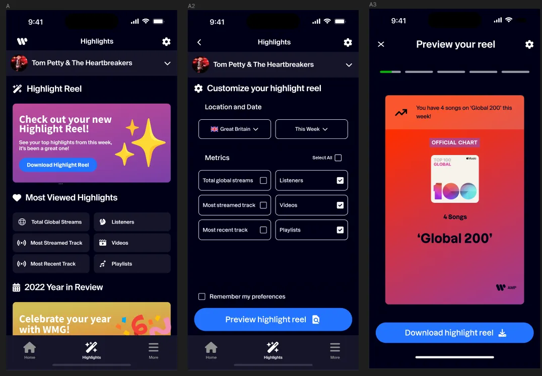
The early problem was structural before it was visual. We needed to decide how cards should stack, what hierarchy they should follow, and how the flow would translate across device contexts. I used block wireframing in Axure to move quickly through layout options, keep the discussion focused on information and behavior, and stay grounded in implementation constraints coming from Flutter and the existing product.
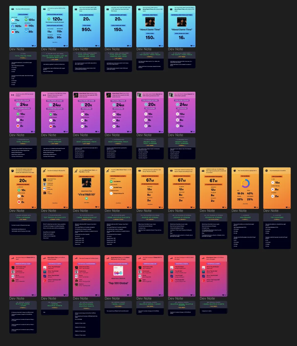
Turning analytics into a reusable card system
The most important packaging decision was not the carousel itself. It was the taxonomy behind it. I cross-referenced the spreadsheet from the Product Owner with usability feedback to determine which metrics should be grouped together and how those groups should read when shared publicly.
That led to a broader card taxonomy spanning audience, streaming, playlisting, charts, source-of-stream, geography, recent-release performance, and social video metrics, plus clearer grouping and visual rules that made the set easier to scan and easier to assemble into story-ready packages. This was where the work moved from “share some stats” to a more disciplined system for packaging analytics.
The prototypes were then tested in responsive flex containers and built into a clickable flow for the next validation round. The card family also had to expand to cover additional ranking and chart-state variants rather than relying on a single happy-path template.
Research and validation
Working with a dedicated research team
This feature was shaped alongside a dedicated research team rather than treated as a one-off design handoff. We built a research roadmap that combined targeted surveys with rolling research sprints, so the team could keep pressure-testing what users actually wanted to share and how well AMP fit into their working habits.
Early discovery work helped frame four recurring questions before later usability testing: whether AMP's data felt trustworthy enough to share publicly, how artists and managers differed in what they wanted to see first, which insights felt actionable rather than merely available, and how platform context shaped sharing behavior. That framing helped the team treat Highlights as more than a visual export problem before the later moderated rounds.
Four moderated tests changed the feature
Four moderated remote tests exposed the difference between a feature that looked appealing and one people would actually use.
Users liked the idea of a carousel, but the initial category choices and data accuracy felt too rigid. Some wanted more control over what got shared. Others referenced Spotify-style story packages that bundled several related cards together. The more important finding was that relevance changed by role. Artists and managers were both core audiences, but they did not care about the same KPIs in the same order, so a single undifferentiated package created noise instead of clarity.
That feedback changed the direction in three concrete ways:
- clearer labeling and aggregation rules for cards
- stronger role-based filtering of what belonged in a package
- less reliance on preselected assumptions about which KPIs mattered most
"I like the carousel idea, but I'm not sure I would want to share these categories. Is there a way to customize or change what's being shared?" - Artist at WMG, usability test
"On Spotify, you can share an entire story, which includes several cards and statistics. Is there a way you can help us do this?" - Manager at WMG, usability test
Final screens and handoff
Packaging a share flow that felt native
By the final iteration, the feature addressed the main issues surfaced in testing. The design moved toward a story feature that let users share up to three cards in a single post, while the data itself was rearranged to better match role-based priorities. Redundant information was cut back, and the package became more focused and more believable as something a real artist team would actually publish.
I also worked closely with engineering on native-component and flexbox considerations so the design stayed realistic in implementation, not just in prototype form.
A future direction, not just a cleaned-up MVP
Alongside the shipped flow, I also explored a more integrated future-state concept that brought Highlights closer to AMP's core analytics experience. This work was directional, but it helped consolidate what the team was learning about grouping, relevance, and share behavior.
Outcome
The Highlights feature shipped as a native social sharing workflow inside AMP, replacing a manual screenshot-and-crop behavior with a more structured, story-ready package of verified stats.
The more durable outcome was not a decorative share layer. It was a clearer system for deciding which analytics were worth sharing, how those insights should be grouped, and how role-based relevance should shape the package. That work helped reduce manual reporting overhead and improved clarity for stakeholders while giving the team a research-backed direction for future iterations.
Appendix
The artifacts below are available for deeper inspection, but they are not part of the primary scroll because they work better as supporting receipts than as core narrative beats.
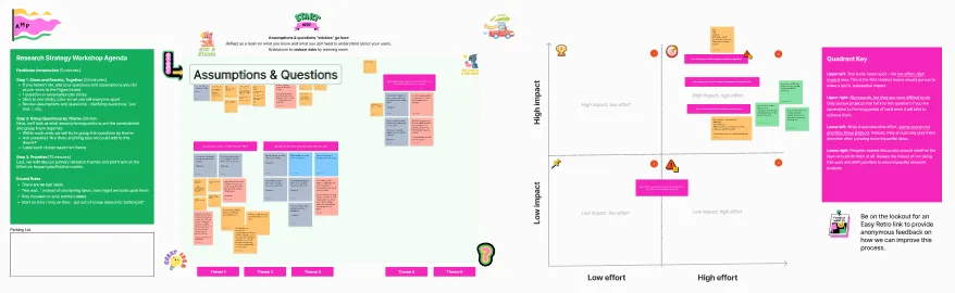
Research and discovery receipts