On this page
Case Study
H&R Block / Spruce
Embedding regulated banking enrollment into tax filing
What this proves
I can embed regulated financial enrollment into an existing enterprise journey where legal copy, platform lock-in, multi-surface coordination, employee usability, and customer comprehension all shape the final design.
Why this mattered
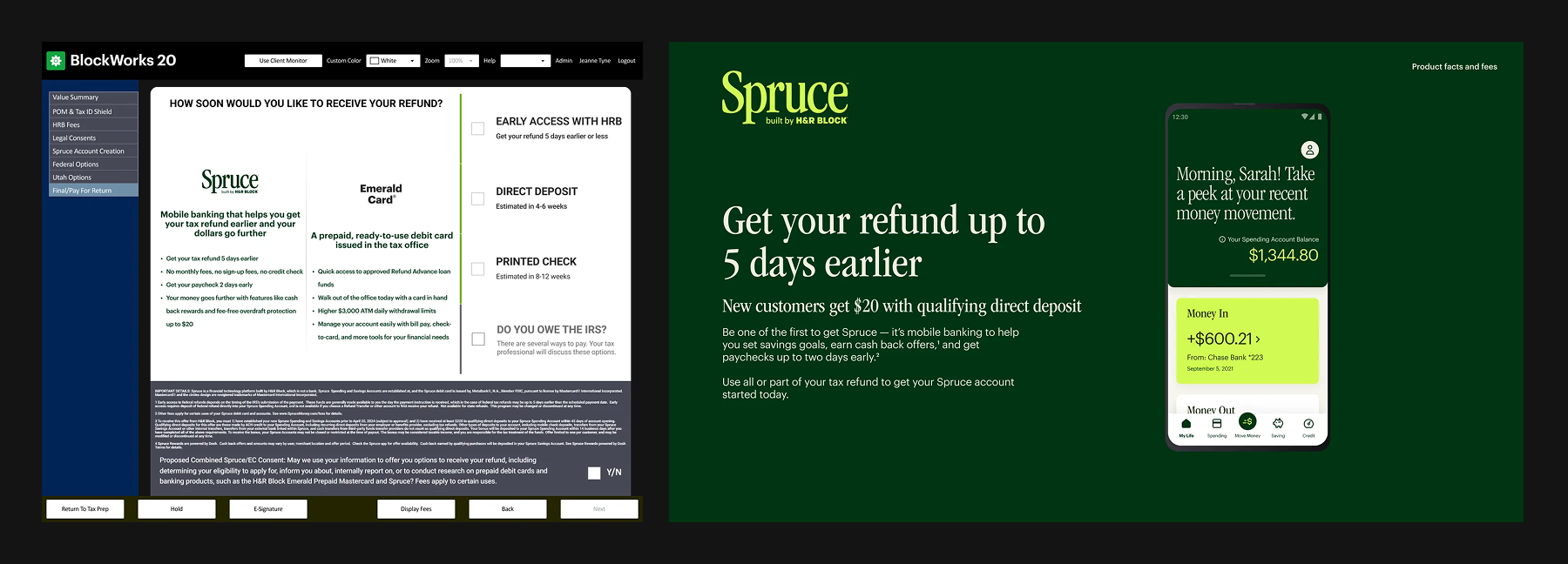
Spruce was a new banking product being introduced into H&R Block's existing tax flow. The challenge was not inventing a fresh onboarding journey from scratch. It was fitting a regulated financial offer into a live ecosystem that already spanned multiple products, handoffs, and user types.
The work had to function across four surfaces: in-office tax-prep software, the customer-facing companion monitor, online flow, and mobile. That made this less like a standalone fintech funnel and more like a service-layer integration problem. Every decision had to hold up across customer comprehension, Tax Pro workflow, business incentives, legal review, and the realities of legacy software.
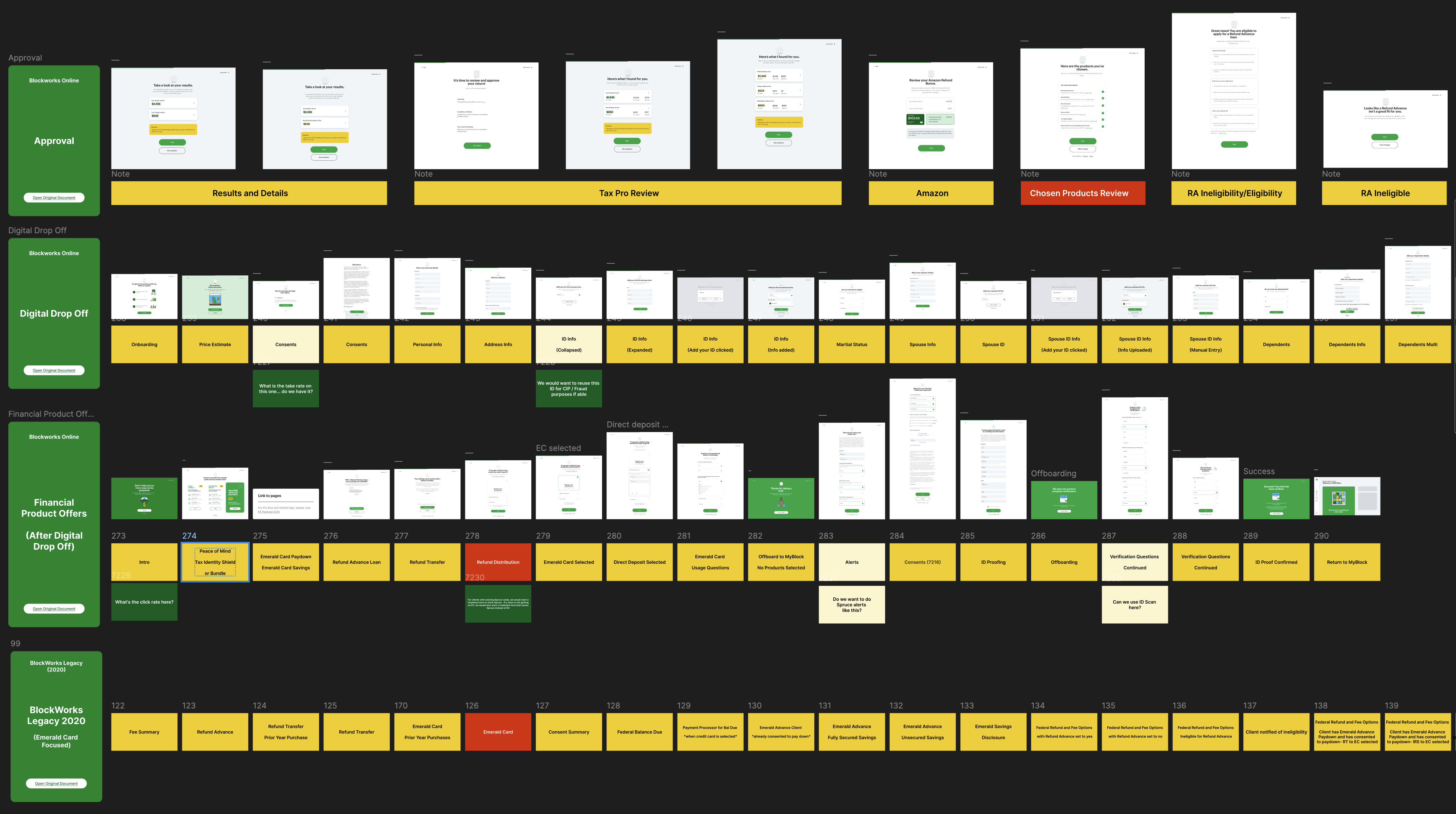
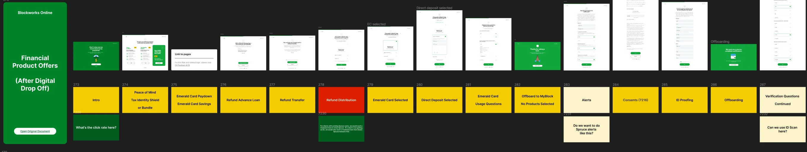
Mapping the H&R ecosystem before changing screens
Before designing individual screens, I worked with stakeholders to inventory H&R Block's existing products, service paths, and decision points. The integration problem was inherently branching: customers entered different paths, made different choices, and encountered different combinations of offers depending on channel, product context, and in-office progress.
That meant the system needed a source-of-truth view of the journey before any single screen could be trusted. I used flow maps and working boards to identify where Spruce prompts belonged, where they would create friction, and which adjacent teams needed to sign off on overlaps. Not every touchpoint carried the same implementation weight, but the mapping work made clear where deeper integration was required and where lighter alignment would be enough.
Designing inside locked software constraints
One of the defining conditions of the project was platform lock-in. The in-office software had tight UI and technical constraints, which limited how far the interaction model could drift from existing structures. This was not a greenfield redesign where new architecture could be invented freely. The job was to make the enrollment feel integrated and understandable without assuming control over the whole environment.
That constraint shaped the wireframing approach. I focused on conditional logic, decision sequencing, and message clarity inside the boundaries the system could actually support. The work was less about expressive interface invention and more about making a rigid environment behave intelligently.
Multi-surface enrollment in the office
The in-office experience made the project more interesting and more difficult. Customers were not only navigating tax-prep decisions. They were also seeing parts of the process through a companion monitor while the Tax Pro worked in a separate software environment. That created two different jobs to be done at once.
The Tax Pro needed enough context and detail to explain the offer confidently, answer questions, and move the flow forward without losing trust. The customer-facing monitor needed the opposite in key moments: simpler framing, less legal clutter, and clearer sign-up cues. The in-store handoff pattern, including QR-based sign-up support on the companion monitor, emerged from working through what information was legally passable and what was merely distracting.


Designing for two audiences with different information needs
Usability testing made one tension unmistakable: customers and Tax Pros did not want the same thing from these screens. Customers were quicker to feel overwhelmed when too many options or too much product explanation appeared at once. Tax Pros, by contrast, often preferred denser screens because the extra detail helped them explain choices and sell related H&R Block products more effectively.
That split mattered. A generic "simplify everything" instinct would have made the flow worse for the person guiding the conversation. The right move was not uniform minimalism. It was selective compression: simplify where customers needed confidence and speed, keep useful density where Tax Pros needed context and control.
Turning testing into clearer decision paths
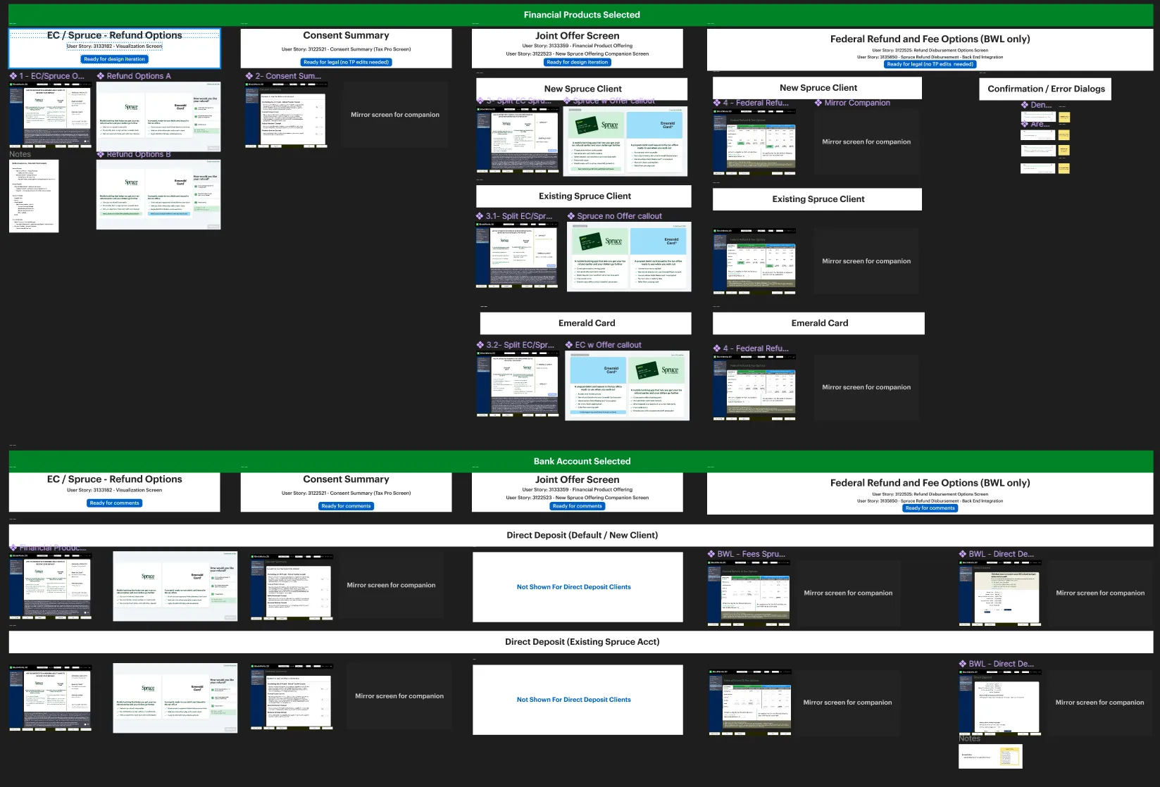
I partnered with H&R Block's research team to run multiple rounds of usability testing with both customers and Tax Pros, moving from wireframes to higher-fidelity prototypes. Each round explored different copy densities, sequencing strategies, and sign-up prompts. The design work evolved through repeated adjustments rather than one large redesign moment.
Several changes recur across the source material and are worth foregrounding because they are defensible:
- Removed nonessential legal copy from the companion monitor and portions of the Tax Pro flow where it added friction without helping decisions
- Reframed the offer around refund timing so the value proposition matched real user expectations
- Refined choice architecture and copy to steer users toward clearer, higher-conversion paths
- Let users continue through earlier steps without forcing an immediate signup decision, improving flexibility and reducing resistance
Outcome framing
The strongest defensible outcome claim in the source material is a reported 30% post-launch lift in Spruce signups. The right editorial claim is not that one isolated screen caused that result. The stronger claim is that the redesigned flow, shaped through cross-functional alignment and repeated usability testing, contributed to the production experience that generated that lift.
Outcome
The Spruce integration shipped across H&R Block's tax journey, including in-office and digital contexts. The work established a reusable pattern for embedding regulated financial enrollment into an existing service flow without treating the banking offer like a detached marketing funnel.
Just as important, the project demonstrates a more durable capability: designing for a system where customer comprehension, employee usability, legal approval, content strategy, and software constraints all had to align at once.