On this page
Case Study
CSL Behring / Fuze
Designing trust in a research data catalog
What this proves
I can design trustworthy AI and collaboration patterns for regulated research environments where source visibility, attribution, and verification matter as much as retrieval speed.
Getting oriented
Fuze is CSL's internal research data catalog. Scientists use it to browse datasets through metadata and dense tabular views. Before this project, the catalog displayed data but offered no way to discuss it in context. Feedback lived in email threads and Slack channels, disconnected from the values being questioned. AI retrieval existed in prototype form, but it still needed trust scaffolding before scientists could act on its output.
I started by auditing the existing catalog surface, CSL's evolving design system, and adjacent AI and collaboration patterns. The goal was to understand where discussion should live, how source visibility should work, and how much of the workflow needed to stay anchored to the dataset rather than moving into a generic assistant surface.
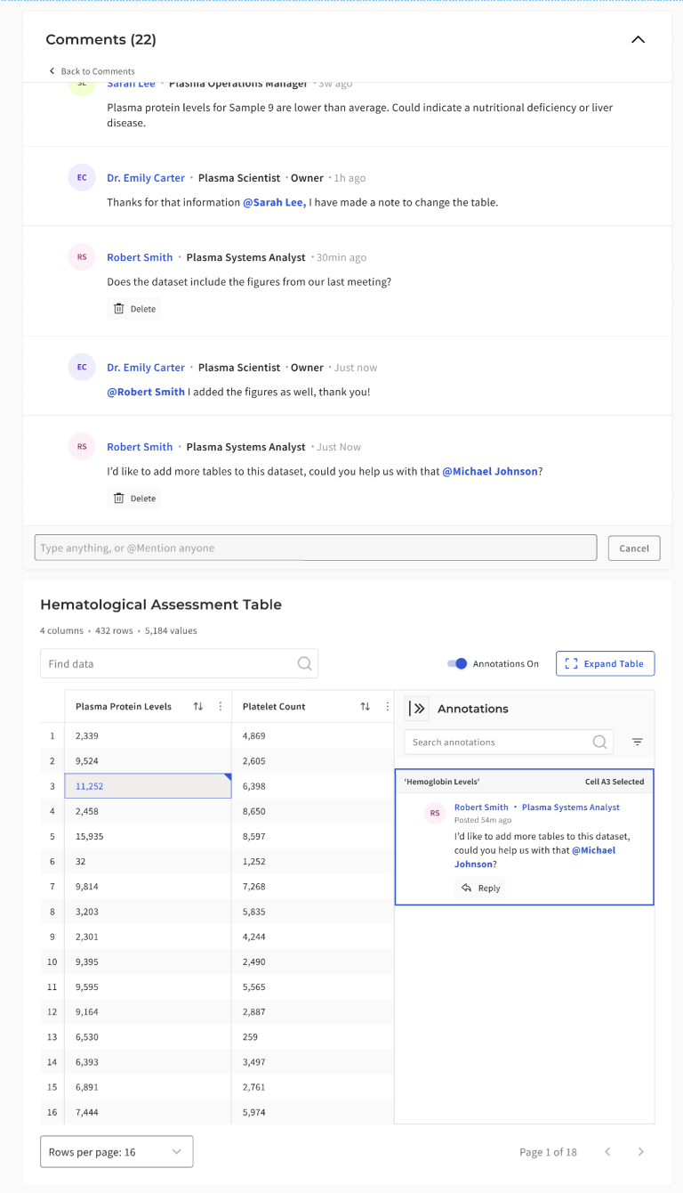
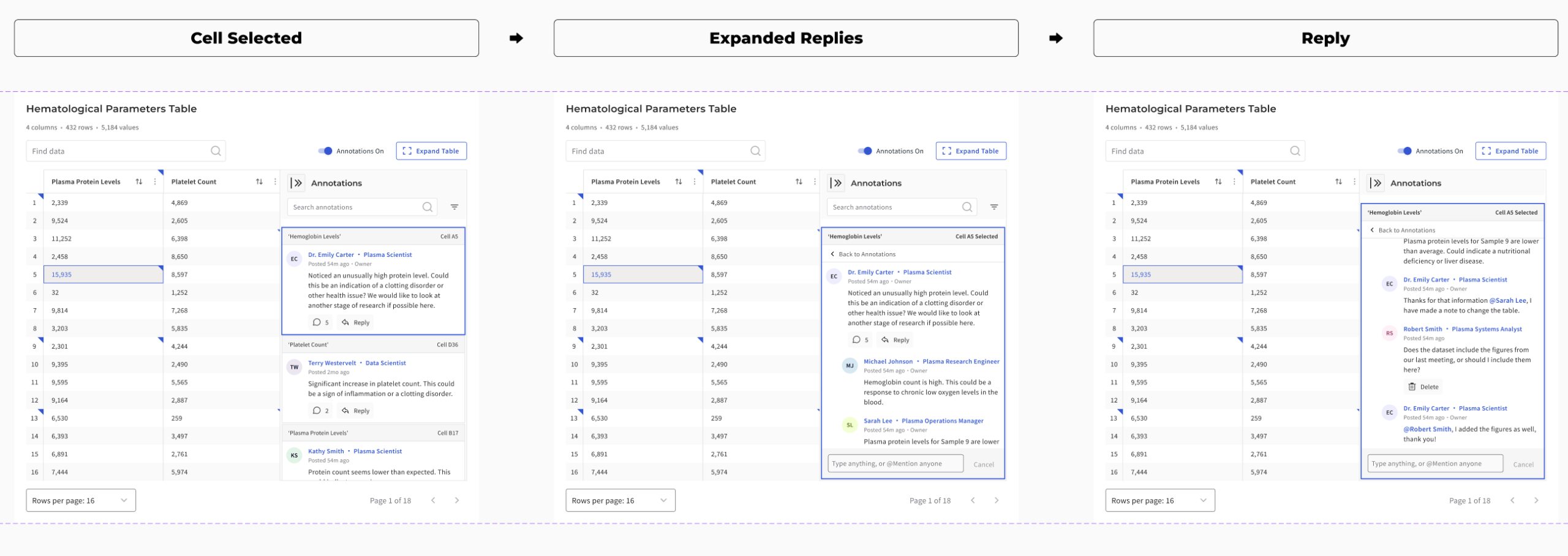
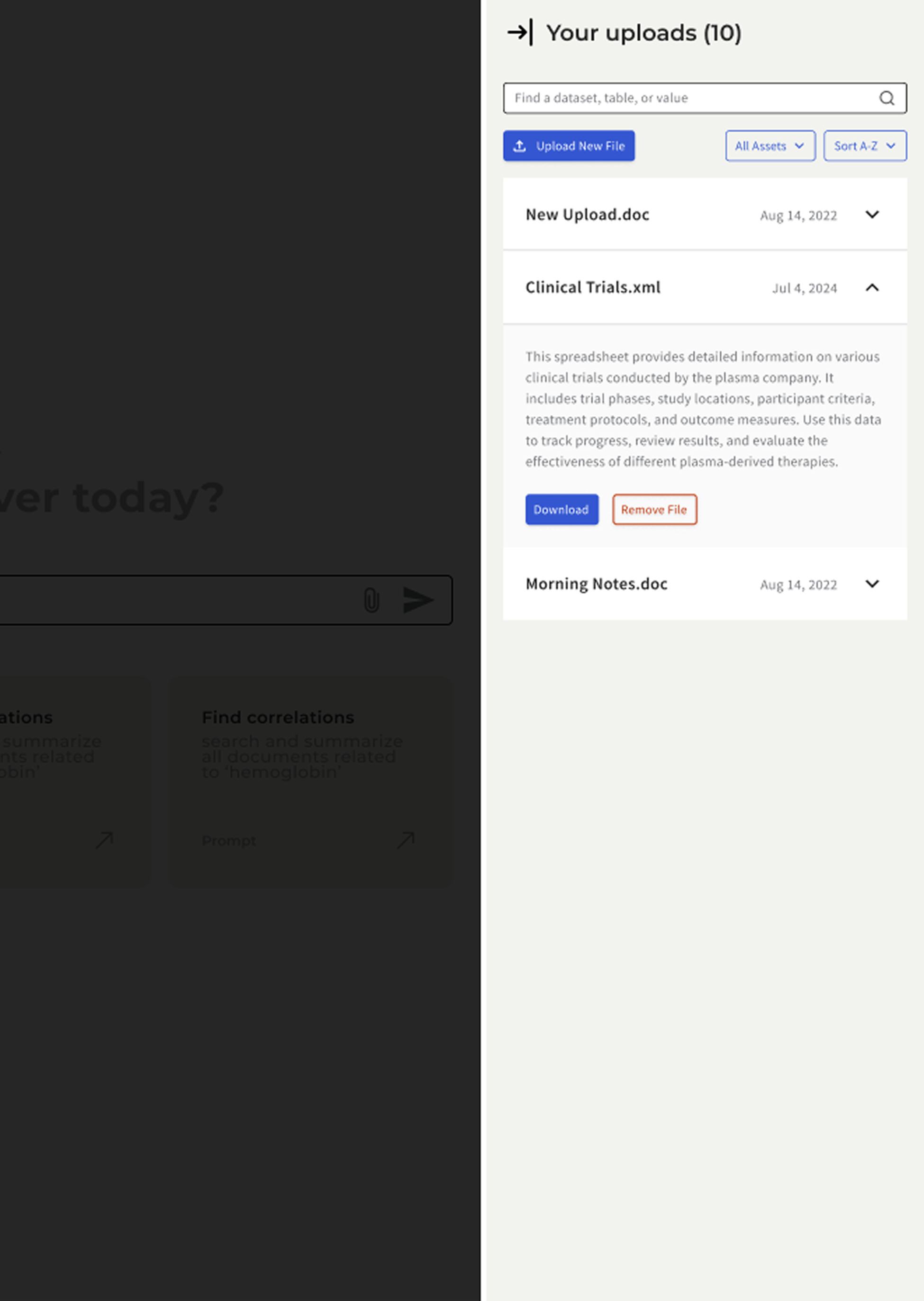
Annotations and Comments (Shipped)
Making research tables conversational
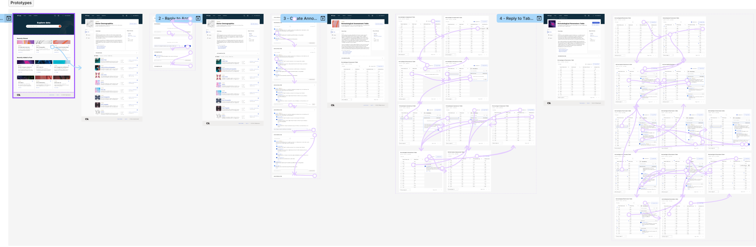
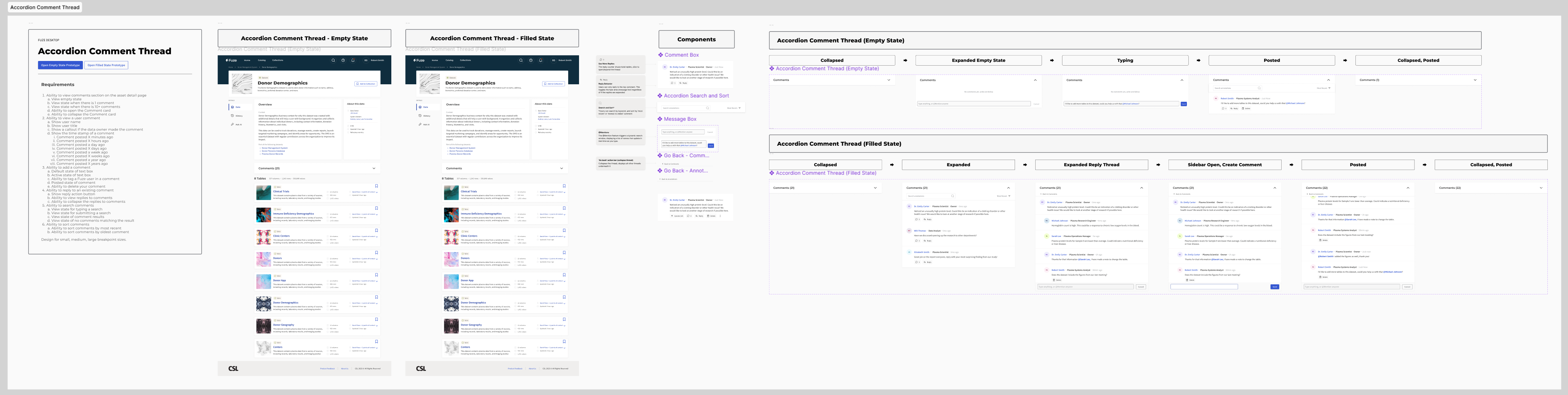
Static data tables offered no way to clarify or question values. I introduced cell-level annotations that allowed users to open comment threads directly within a dataset. Progressive disclosure patterns kept tables readable by showing only one master thread per cell. Multiple action-bar layouts were tested to maintain accessibility at narrower widths and to preserve clarity inside a scan-heavy table surface.
The table workspace also needed structural work beyond comments. I used spreadsheet-informed patterns such as frozen headers, sortable columns, inline indicators, and density controls to support the way scientists actually moved through data. The comment system had to fit into that environment without overwhelming it.
How I anchored discussion to data
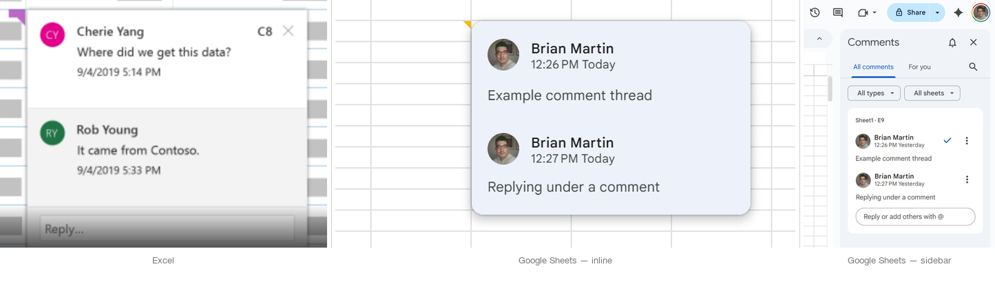
Before locking the annotation model, I looked at how spreadsheets and other table-heavy tools handle notes, comments, and indicators. The goal was not to copy Excel or Google Sheets directly. It was to borrow the interaction logic that already makes dense tabular discussion legible: visible markers, clear attachment scope, and side-panel patterns that preserve the table as the primary surface.
- Indicators needed to be discoverable without overwhelming the table
- Thread scope had to stay obvious: page, row, or cell
- Overlay-heavy patterns were too fragile for dense catalog browsing
- Sidebar-based disclosure preserved scan speed while keeping discussion attached to evidence
Why scope had to be explicit
Early exploration suggested that combining page-level and cell-level discussion into a single panel would simplify the interface. Testing pushed the design in the opposite direction. Scientists needed clearer scope boundaries so they could tell whether feedback applied to the full dataset or a specific value. Merging the layers was simpler to build but more ambiguous to use. Separating them added one interaction step but made the system easier to trust.
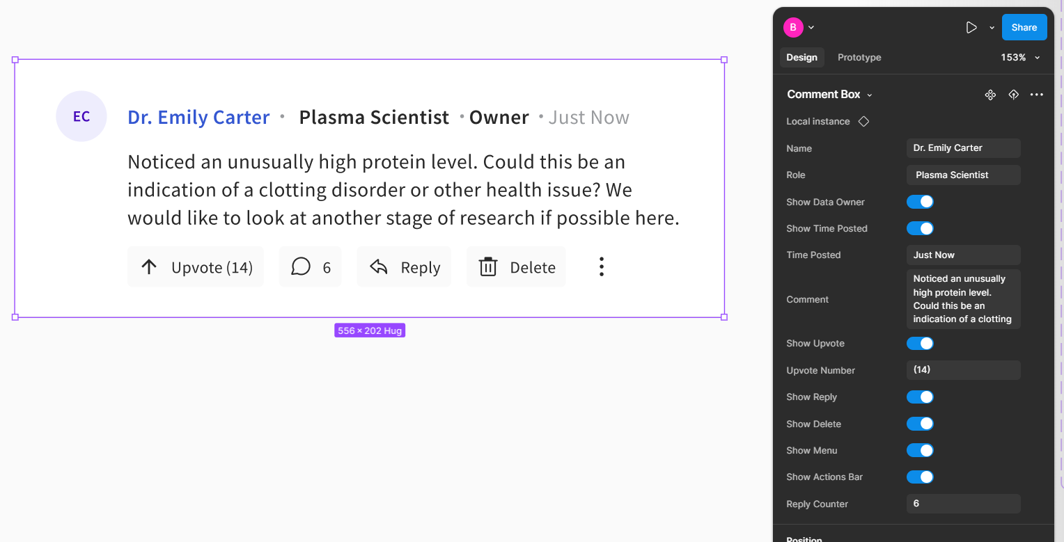
Reusable comment architecture
The discussion layer also needed to scale beyond one good screen. I built the comment system as a reusable component pattern with state coverage for replies, permissions, counters, and visibility rules, rather than treating each thread view as a custom layout.
- Supported different thread contexts without duplicating components
- Made permissions and reply behavior easier to test visually
- Helped keep annotation UI consistent across page and cell-level patterns
- Improved engineering handoff by clarifying state coverage
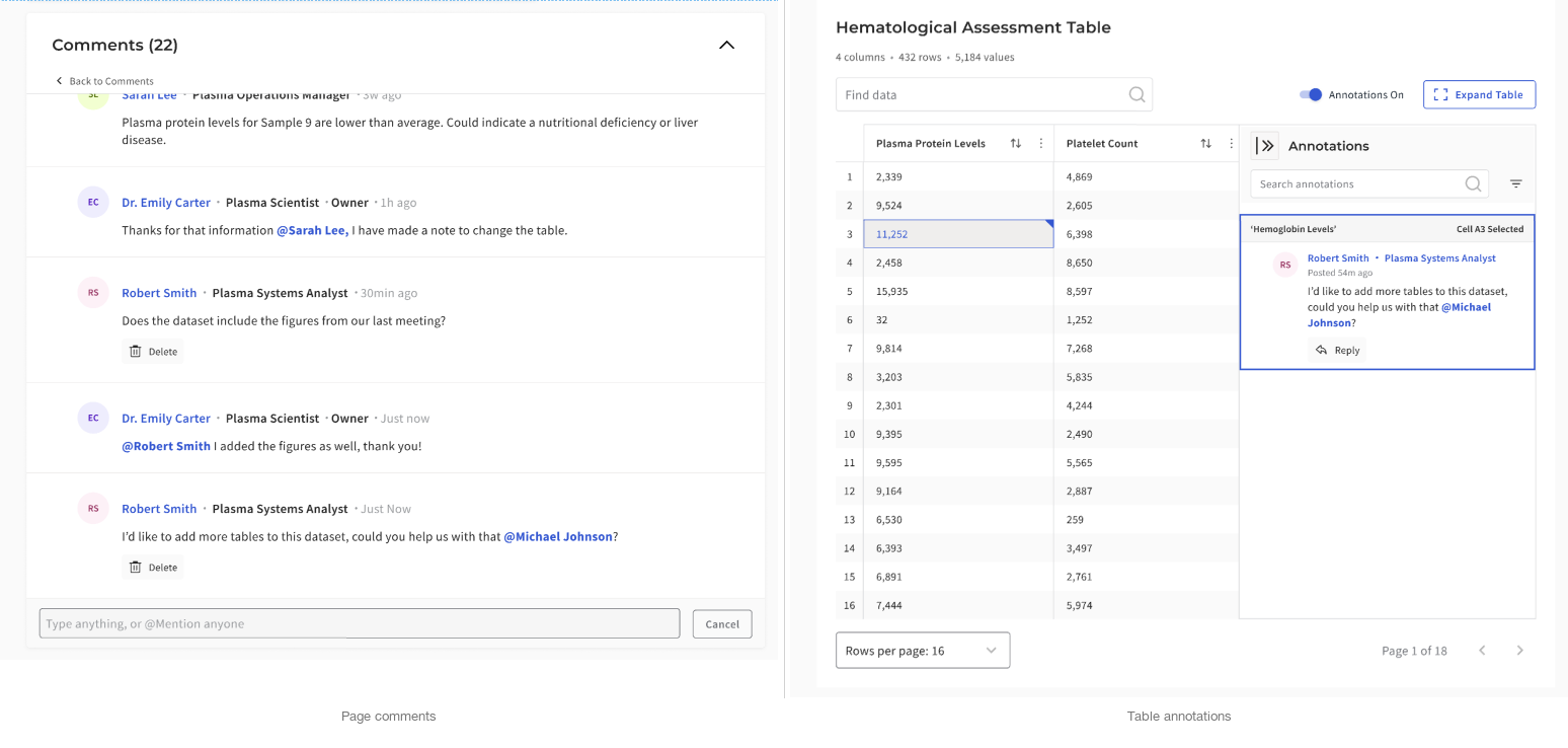
Two layers, two kinds of discussion
Not every question belonged at the cell level. Some comments were about the dataset as a whole, while others needed to stay pinned to a specific value. Keeping those two layers distinct made the system easier to trust and easier to resume.
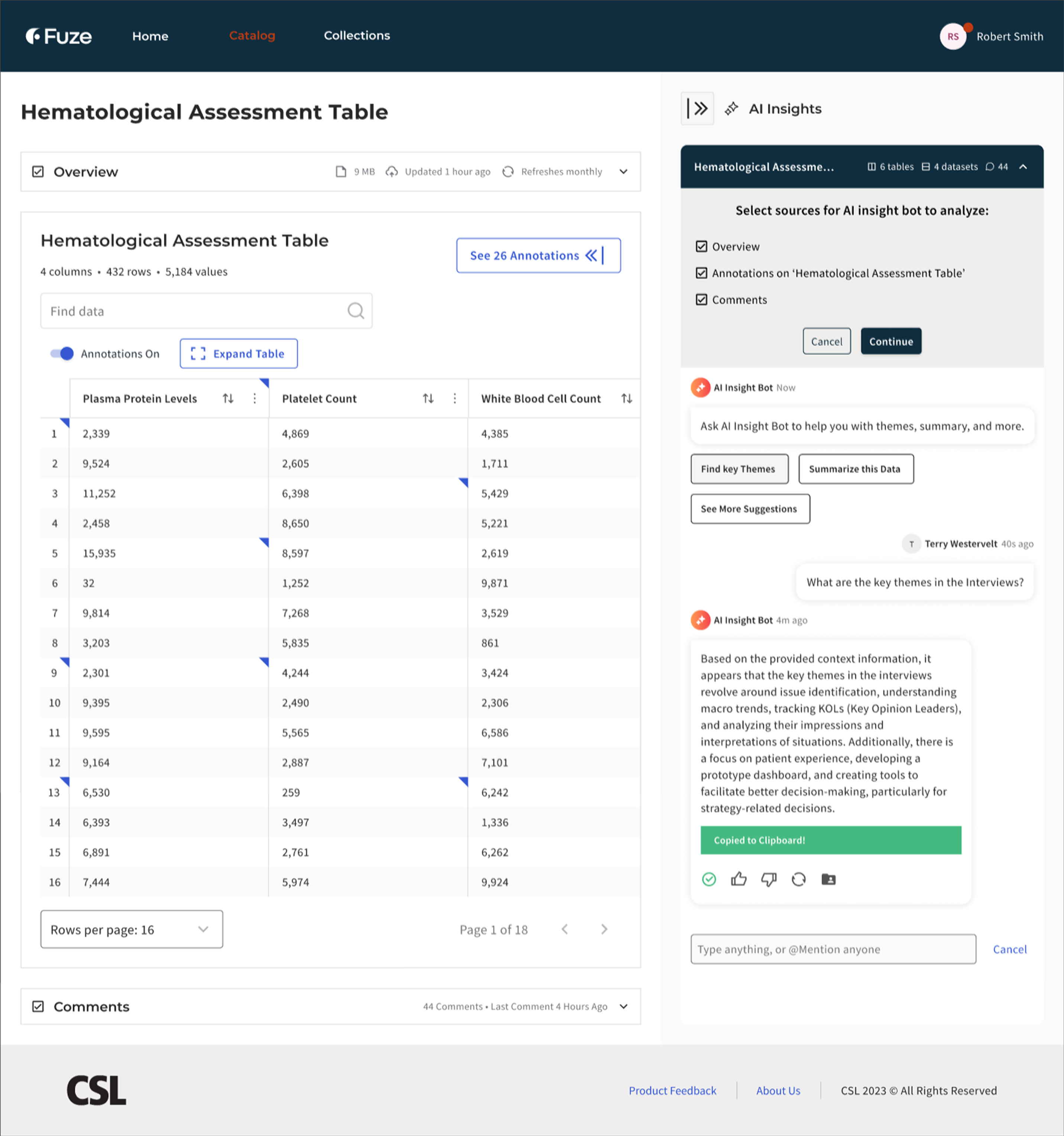
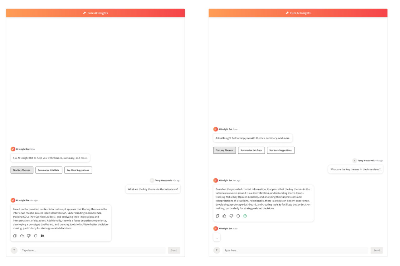
Ask AI (Internal Pilot)
Grounded retrieval, not chatbot UX
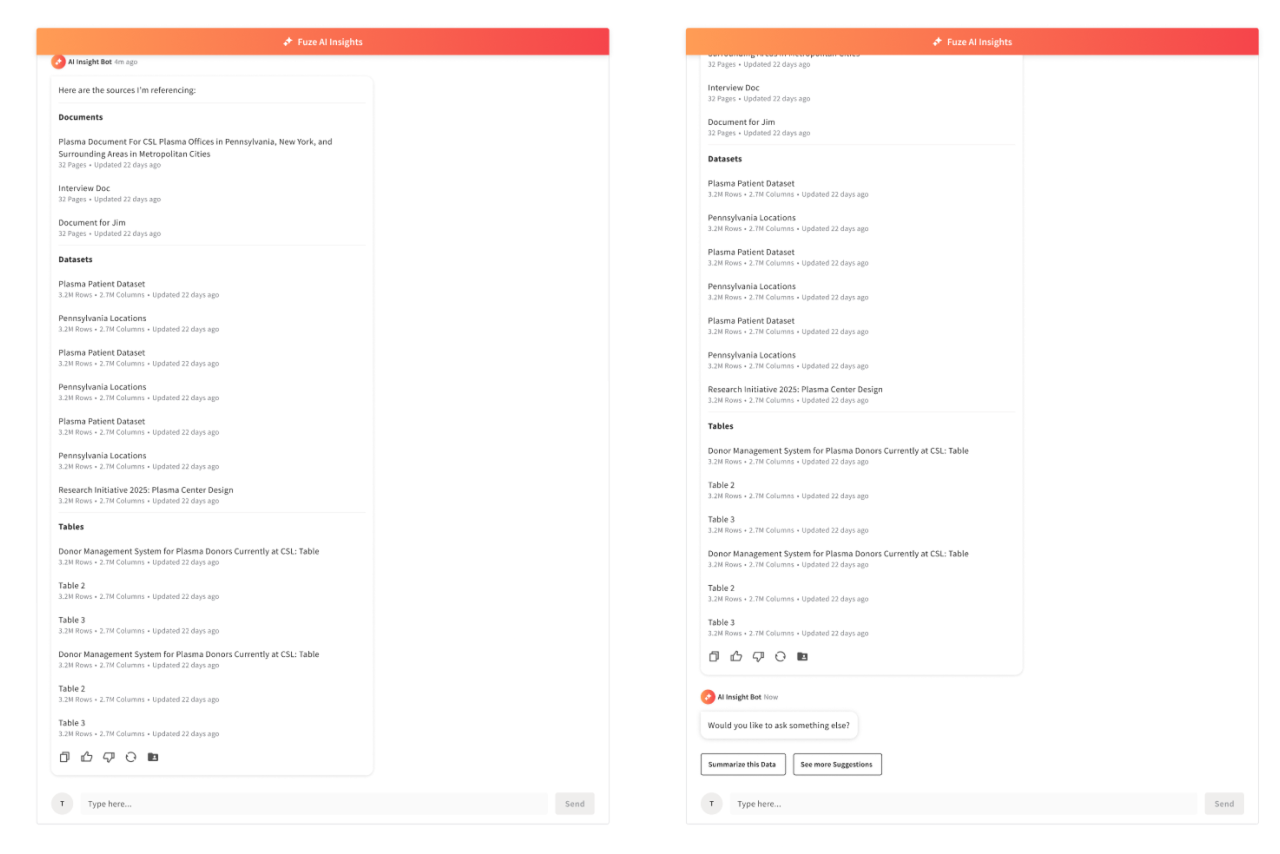
CSL was piloting AI retrieval inside the research catalog. The system could answer questions about datasets, but trust depended on visible grounding. The patterns we reviewed across adjacent AI tools were technically capable, but they still treated answers more like endpoints than starting points for investigation. Scientists needed to verify claims against source data, not take generated summaries on faith.
I positioned the assistant as a discovery and orientation tool rather than an authoritative answer engine. Every response showed its sources co-equally alongside the answer, scoped its context explicitly, and made the underlying data inspectable. The goal was not “better chatbot,” but a trustworthy starting point for investigation.
How the assistant stayed grounded
The guardrails were not generic chatbot safety patterns. They were designed around the retrieval and scope issues that made scientists question whether an answer was trustworthy in a research context.
“I don’t know” was treated as a first-class response state, not an error. Scope indicators clarified what data was in play for a given query. The interaction model was designed to avoid extrapolating beyond visible evidence. These patterns came from observing what happened when answers were vague, overconfident, or difficult to trace back to source data.
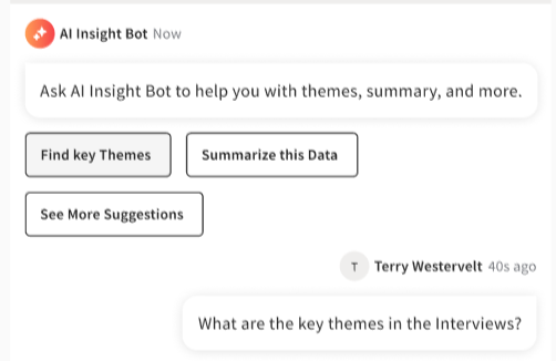
Discovery over prompting
Rather than expecting scientists to write effective prompts, the interface offered structured entry points. “Find correlations,” “Summarize dataset,” and “Find annotations” reduced blank-field ambiguity and encoded common research intents as guided actions. The surface needed to feel like a research tool with known capabilities, not an open-ended conversation partner.
How users grounded the assistant
The upload and context-setting flows determined what the assistant could reference. I designed three related patterns:
- Session-only uploads for temporary context during a single investigation
- Page-level uploads for repeat reference tied to a specific dataset
- A file manager surface for visible working-set control across sessions
Each pattern made the assistant’s evidence boundary explicit. Scientists controlled what the model could see rather than guessing what it had access to.

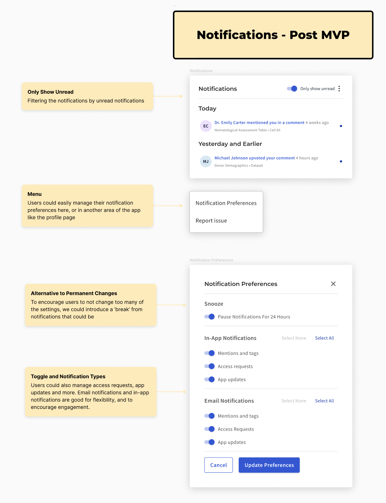
Prototype: FuzeAI Workspace (Did Not Ship)
Scaling toward a full assistant interface
This was a directional prototype used to help leadership understand the longer-term platform opportunity. It did not ship.
The sidebar assistant worked for quick queries within a single dataset page. But scientists’ real workflows were multi-session and iterative. They returned to earlier findings, cross-referenced sources, and refined questions as new data arrived. The prototype explored what a fuller research workspace could look like if continuity, evidence scope, and guided exploration were treated as first-class parts of the system.
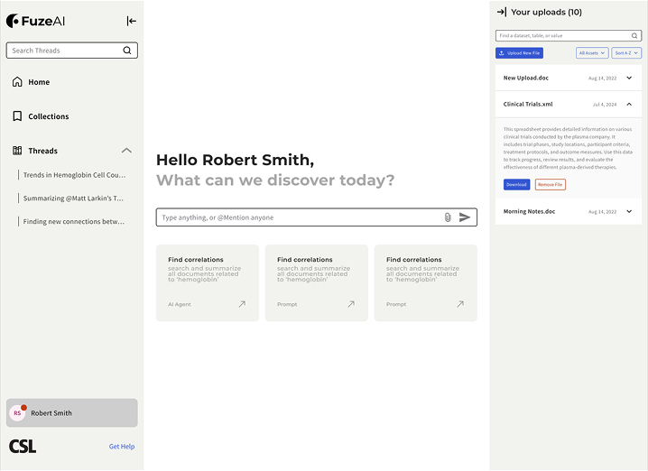
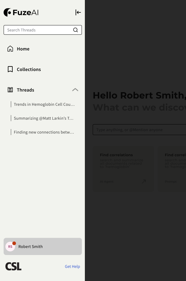
Workflow memory (left rail)
The left rail preserved research intent over time. Threads worked as resumable questions, while collections grouped related investigations. Instead of restarting from a blank prompt, scientists could return to an earlier line of inquiry with its context intact.
Evidence scope (right rail)
The right rail made the assistant’s working set explicit. Uploaded files, indexed datasets, and active context stayed visible, so the model’s boundary was inspectable instead of implied. This extended the same source-visibility principle used in Ask AI, but at a workspace level.
Prompt surface and guided intents (center)
The center surface stayed task-focused. Prompt starters and guided actions reduced blank-prompt ambiguity, while collapsible rails allowed a more focused reading mode when needed. This carried the same discovery-over-prompting principle from the Ask AI pilot into a longer-running workspace model.
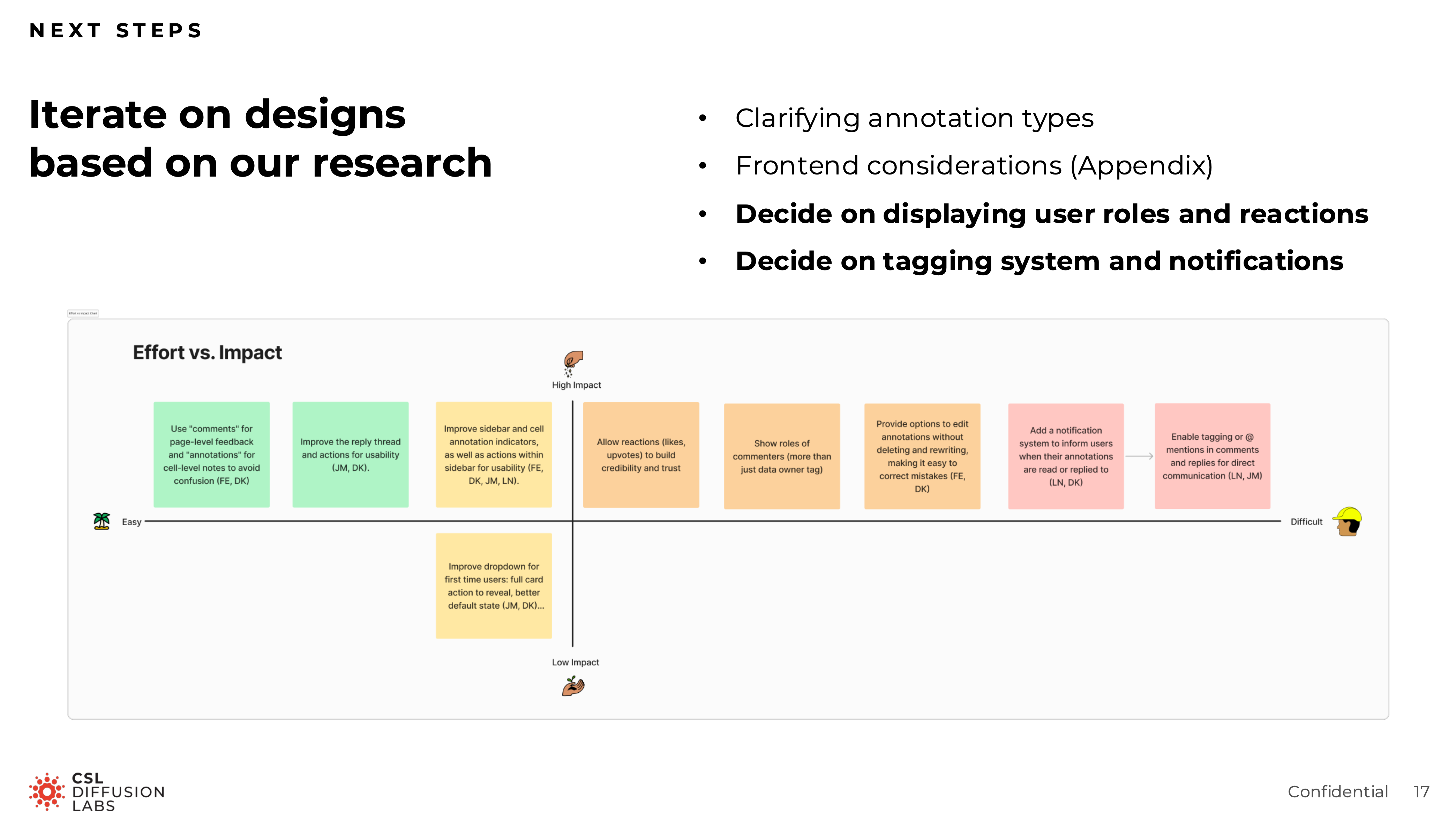
Research and Validation
Consolidated findings across the project
Rather than treating research as a separate process phase, this work evolved through ongoing review, prototyping, and moderated sessions with research scientists across approximately eight rounds. Each round fed back into the next sprint through updated prototypes, recommendations, and handoff-ready specs.
The most consequential finding was counterintuitive. Early concepts treated AI as something that should feel seamlessly embedded into the catalog. Testing suggested that this actually reduced trust. Scientists wanted to feel they were deliberately invoking the assistant, not being passively routed through an AI layer. More integration was not more trustworthy. The final direction reflected that: the assistant was a tool you reached for, not a layer you passed through.
Other findings shaped the shipped and piloted work:
- Source visibility needed to stay prominent
- Annotation scope confusion was the largest friction point in the comment system
- Guided prompts worked better than an empty text field
- Scientists wanted to understand the assistant’s boundaries before trusting its output
Outcome
The annotation system shipped and entered production use. The Ask AI assistant launched as an internal pilot with research scientists. The workspace concept informed roadmap discussions about how Fuze’s AI capabilities could expand over time.
Across approximately eight rounds of moderated usability testing, the design evolved from a more ambient AI concept into a deliberately invoked, source-visible, scope-aware research tool.
The more lasting outcome was a design language for trustworthy AI in regulated research: visible sources, conservative confidence, explicit scope, and user-controlled invocation rather than ambient intelligence.
Appendix
The artifacts below are available for deeper inspection, but they are not part of the primary scroll because they work better as supporting receipts than as core narrative beats.
Annotations receipts
Ask AI receipts

Workspace receipts